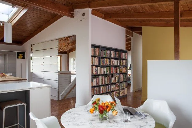
The Before and After… and After That
I don’t include before photos in my portfolio because I think it’s just unfair. First of all, I am not near as talented as my architectural photographer so the before shots are distracting and dark and more importantly no one ever cleans up for them.
Like those face serum advertisements where a tired model working hard to look bad is placed next to a glamorous, touched up, and well lit version of herself; it’s clearly the result of this miraculous product, right?
I’m skeptical. However, I get requests for these shots all the time and have tried to understand why people like to see them so much. Is it because they can unravel the vision that the architect had and hopefully apply some of the same strategies to their own space? Or could it be a twisted form of self-soothing……a way to commiserate with other homeowners who have lived in undone, broken or “uncool” surroundings?
I believe it’s because the middle of the project is completely skipped over in lieu of a simplified snippet of time passing. It’s instant gratification. The initial excitement at what your architect presented, the painstaking decisions, the bills, the trips to the tile store, the smell of lumber and sound of nail guns……all are conspicuously missing. Nobody wants to see a before shot, 20 middle shots and then the after.
What I’d like you to know is that architectural photography is lovely to look at but it is loosely based on reality. This isn’t a judgement or necessarily bad. A good architect knows that creating beautiful, functional and livable spaces is foremost and doesn’t always guarantee that those spaces will photograph well or look good on a screen.
Photographers have many digital tools they use in what is called “post production”. Photoshop can eliminate unsightly floor vents or the stains on your couch. A high tech combination strobe, flash and accent lighting brings light into corners and crevices where normally no light would exist. We can even piece together different wide angles of the same space in order to show more…yes, like a Picasso.
Four examples of transformative before and after shots followed by a few truthful secrets of “post production:”
Before
After
After That:
Notice how much more we can capture with an extra wide professional lens. Sunset magazine shot this house and I witnessed them stich two entirely different photos into one view of the space. We debated about whether the stair fixture bulb was distracting, so we removed it. What do you think?
Before
After
After That:
There is never room for a dull or cloudy day when photographing architecture and what about that flood light…who put that there?
Before
After
After That:
It took two full days to prepare for this photo shoot. This wonderful family occupies every inch of their newly remodeled space with musical instruments, kids artwork, toys, science experiments, and “not quite right” furniture. Within minutes after the photo shoot the lively and much more fun Truth moved back in.
Before
After
After That:
Final decisions can be aided by the use of Photoshop…how do you like this front door color?
These “post production tools” are wonderful to have at our disposal, but since so much of the way we are experiencing architecture now is through a flattened image on a screen we run the risk of losing our grasp on reality. And it seems we are becoming addicted to it.
According to a Renovation in America Finding from the 2013 Houzz and Home survey, Houzz recorded 14 million unique users as of 2013. While we used to have to subscribe, wait for, and finally thumb through the crinkly pages of Architectural Digest or Sunset Magazine, we can now find unlimited options and new ideas 24-7 on our smartphone. Am I the only one who sees the danger in this?
So keep uploading, sharing, saving and being inspired by your design feed…but remember to keep it real.
Nothing is ever perfect, not the before (although it’s probably not as bad as you think) not the middle and certainly not the after….what’s real is what you make of it.
– Lara


